
CHALLENGE 1A
Information was challenging to find.
End users were unsure where to find what they were looking for and unfamiliar with internal jargon.
Reinspiring educational travel in a post-COVID world.
Role
Lead designer
Client
Stanford University
Alumni Association
Timeframe
3 months
Client
How might we create trip discovery experiences that are modern, responsive, and easy-to-use on a limited budget and timeframe?
BEFORE
AFTER
SUMMARY
MOMENTS OF NOTE

01
Complex filters and facets
Prior to this project, I underestimated how complex filter and facet functionality was. I collaborated with our developers, who helped me understand the possibilities and complications with each option. Together we created solutions that addressed user needs and kept us within budget and on-time.
02
Finding an aesthetic balance
Our client was the Travel/Study team; their parent organization, the Stanford Alumni Association, was the project sponsor. The teams preferred opposing aesthetics: immersive, fresh, and modern from the Travel/Study team versus a traditionally "Stanford" look-and-feel that wasn't too distinct. Finding a balance made for fun design challenges and conversations.
PIVOTAL MOMENTS

01
New user group = new approach
We discovered along the way that we had another user group in the mix: the site's content authors and editors. By slightly adjusting our approach, we successfully improved experiences for both end users and content authors/editors alike.
02
Scope expansion
Part of our requirements gathering process entailed learning about Travel/Study team offerings. We found that our scope needed to be greater than originally anticipated, but our timeline and budget allocation couldn't budge. In order to maintain design and development standards (and stay within budget and timeline), we designers and developers worked concurrently, staying in constant communication.
RESULTS
📞
Drop in support requests
Notable decrease in customer support calls, emails, and support tickets
📈
Increase in sales
(anecdotal)
💗
Strong client relationship
Client was satisfied and requested an extended engagement & additional design work
🏆
Webby- nominated
Recognized by Stanford University leadership and nominated to win a Webby by our peers
👀
Increased user engagement
Increase in user sessions, unique users, and unique pageviews
101%
rise in unique users in 1 year
125%
rise in number of sessions
45%
rise in unique pageviews
CHALLENGE 1:
Finding & browsing

End users were unsure where to find what they were looking for and unfamiliar with internal jargon.

The site's structure didn't expose browsing users to all offerings. Navigation was informed by organization politics rather than by user needs.

End users found content, especially "walls of text," difficult to scan, browse, and comprehend.
FINDING & BROWSING
Final designs


SOLUTION 1A
In addition to building a helpful search experience, we designed a pared-down, streamlined navigation with clear, distinct options so that users could see all available services and find what they wanted — fast.

SOLUTION 1B
In addition to address the pain points around browsing, we added a "Collections" page that allows users to explore and discover the possibilities.
SOLUTION 1C
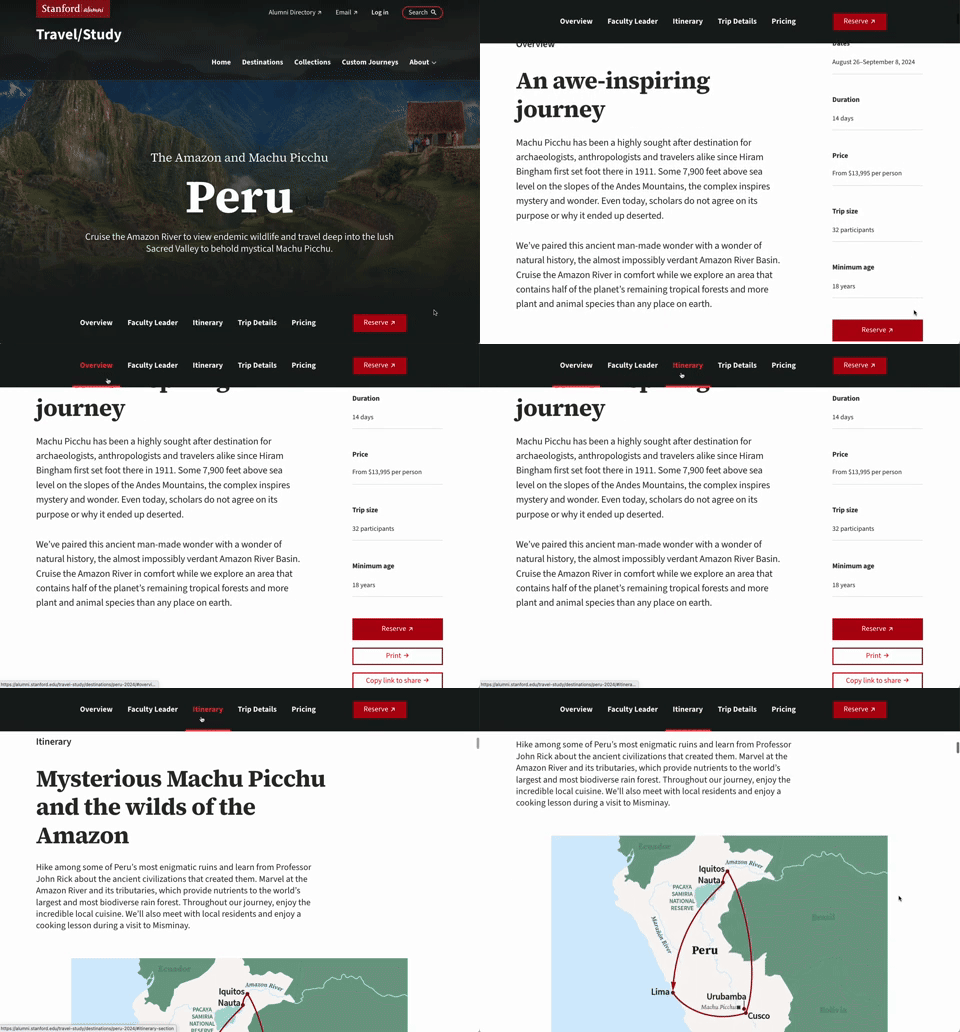
Part of our navigation streamlining included incorporating intuitive page-level jump links for quick scanning and clarity around what information was available.
CHALLENGE 2:
Limited functionality


Because the site was built nearly 10 years ago, the site didn't adapt according to screen size, orientation, or device.

The site used small type, had low color contrast, lacked alt text for images, had inadequate keyboard navigability, was reliant on Javascript, and more.

The few controls end users were given were restrictive. For example, users could only apply one filter or facet at a time.
LIMITED FUNCTIONALITY
Final designs


SOLUTIONS 1A AND 1B
We cross-collaborated with developers and accessibility specialists throughout the design & development processes to ensure the site would be fully accessible and fully responsive.

SOLUTIONS 2C
I listened to how users looked for destinations — by place, specific (or vague) timeframes, and experience type — and designed flexible, robust filter and facet categories and options.
CHALLENGE 3:
Incohesive, inconsistent design


The site was created before design systems were prevalent. Content authors lacked resources like style guides, component libraries, and pattern libraries to reference.
Content authors & editors were forced to make design decisions with a brittle CMS that encouraged poor ones. This forced them to find work-arounds. Different staff made different decisions, leading to design inconsistencies and user confusion.

Content authors & editors weren't equipped with visually compelling story-telling tools, which left them with limited capabilities to appear up-to-date, reliable, and trust-worthy.
INCOHESIVE, INCONSISTENT DESIGN
Final designs

SOLUTION 3A
We designed a robust but simple design system for Stanford Alumni Association (Travel/Study's parent organization) and a sub-theme just for Travel/Study. This allowed them to have their needs met and the needs of their users. Each trip had unique details, so components needed to be adaptable and accommodate all variants.
SOLUTION 3B
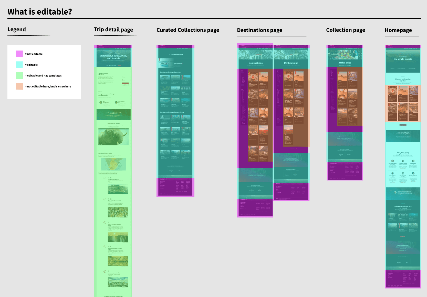
Aside from arming content creators/ editors with tools to create engaging content, we also designed templates to decrease their decision-making and to encourage consistency. Additionally, we created guides & materials to reference post-engagement. Finally, we worked alongside developers to ensure their new CMS was user-friendly.

SOLUTION 3C
We collaborated with map illustrator, Karen Minot, to design itinerary maps & cruise ship diagrams that visually align with each destination's striking, beautiful story.
PREVIOUS

Expanding Stanford University's design system
Reimagining Stanford's donation management web application
